Tutorial 9: Diagnosing Image Quality#
Before building a pipeline, it helps to assess the quality of your plate images. PhenoTypic’s diagnostics plotter gives you objective metrics for noise, contrast, and structure — so you can make informed decisions about which enhancers and detectors to use.
What you will learn:
Use
image.plot.diagnostics()to assess plate qualityInterpret the noise, contrast, and structure metrics
Use quality metrics to guide pipeline design
Imports#
[1]:
from phenotypic.data import load_yeast_plate
import matplotlib.pyplot as plt  # diagnostics() returns matplotlib figures
Load the Plate#
[2]:
plate = load_yeast_plate()
plate.dash()
Data type cannot be displayed: application/vnd.plotly.v1+json
Run Diagnostics#
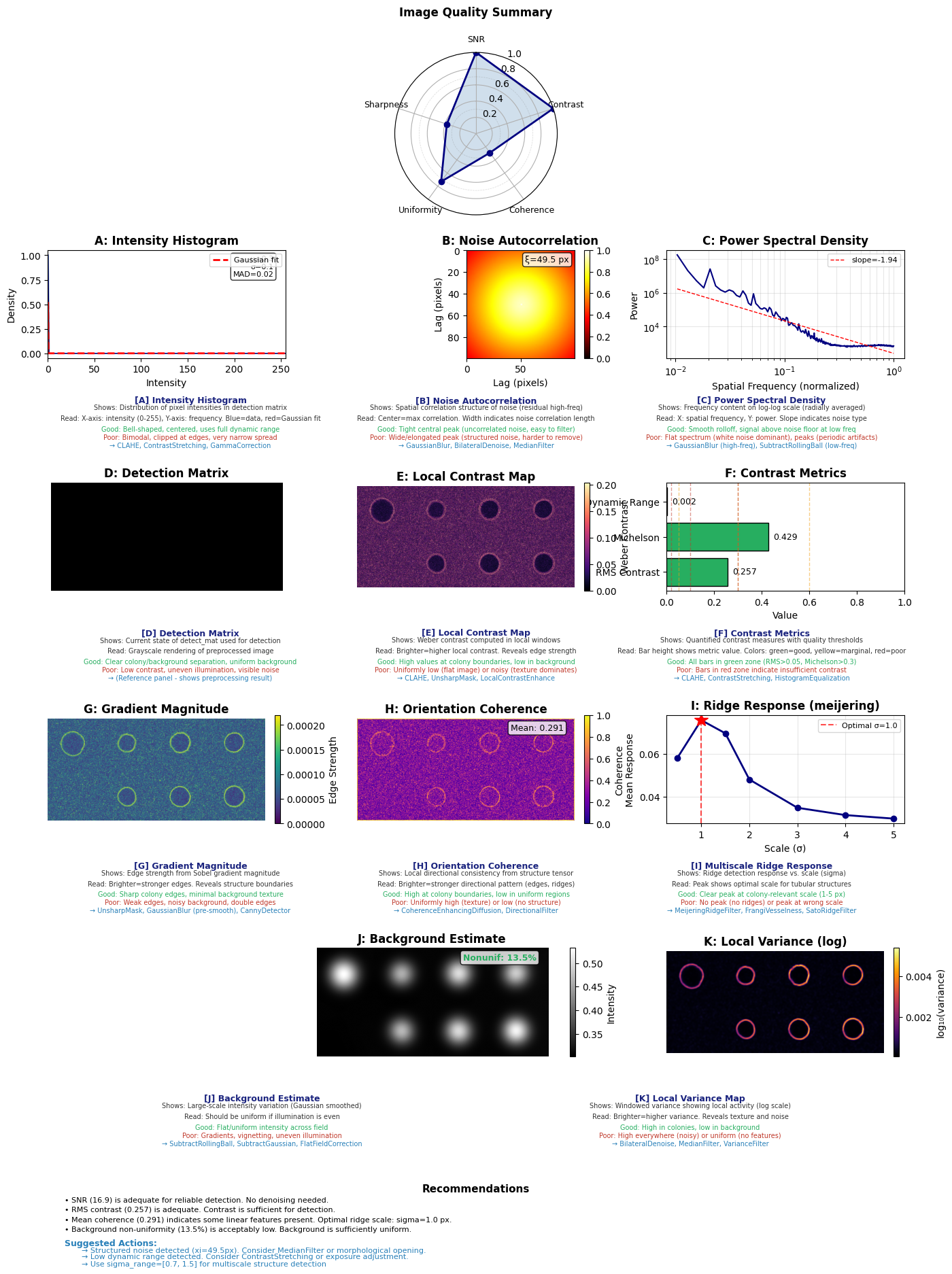
The .plot.diagnostics() method produces a multi-panel figure and returns a dictionary of quantitative metrics. This is one place where matplotlib output is expected — the diagnostics figure is a static multi-panel layout.
[3]:
fig, metrics = plate.plot.diagnostics()
Inspect the Metrics#
The metrics dictionary contains objective measurements organized by category. Let’s look at each one.
[4]:
print("Available metric categories:")
for category in metrics:
    print(f"  {category}")
Available metric categories:
  bit_depth
  noise
  contrast
  structure
  background
  quality_scores
  interpretations
  recommendations
Noise Metrics#
Noise metrics tell you how much random variation exists in the image background. High noise can confuse detectors.
[5]:
if "noise" in metrics:
    print("Noise metrics:")
    for key, val in metrics["noise"].items():
        if isinstance(val, (int, float)):
            print(f"  {key}: {val:.4f}")
        else:
            print(f"  {key}: {val}")
Noise metrics:
  snr: 16.8730
  sigma_mad: 0.0197
  correlation_length: 49.5000
SNR (Signal-to-Noise Ratio) — higher is better. Values below 10 suggest the image would benefit from denoising (
StableDenoiseorGaussianBlur).Correlation length — longer correlation suggests structured noise (e.g., uneven illumination) rather than random pixel noise.
Contrast Metrics#
Contrast metrics measure how well colonies separate from the agar background.
[6]:
if "contrast" in metrics:
    print("Contrast metrics:")
    for key, val in metrics["contrast"].items():
        if isinstance(val, (int, float)):
            print(f"  {key}: {val:.4f}")
        else:
            print(f"  {key}: {val}")
Contrast metrics:
  rms_contrast: 0.2567
  michelson: 0.4287
  dynamic_range: 0.0022
  p1: 0.2520
  p99: 0.6302
RMS contrast — overall contrast level. Low values mean faint colonies that may need
CLAHEto boost local contrast.Michelson contrast — ratio of (max − min) / (max + min). Values close to 1.0 indicate strong colony/agar separation.
Dynamic range — fraction of the bit depth in use. Low dynamic range suggests the image is under-exposed.
Structure Metrics#
Structure metrics assess the spatial organization of the image.
[7]:
if "structure" in metrics:
    print("Structure metrics:")
    for key, val in metrics["structure"].items():
        if isinstance(val, (int, float)):
            print(f"  {key}: {val:.4f}")
        else:
            print(f"  {key}: {val}")
Structure metrics:
  mean_coherence: 0.2913
  optimal_scale: 1.0000
  peak_response: 0.0756
  ridge_responses: [0.05793954400883872, 0.07563562324701593, 0.06950456032556798, 0.04796234141535493, 0.03477529722230368, 0.03136497550995987, 0.02972701604558307]
  scales: [0.5, 1.0, 1.5, 2.0, 3.0, 4.0, 5.0]
  ridge_method: meijering
Gradient mean — average edge strength. Higher values mean sharper colony boundaries, which makes detection easier.
Coherence — consistency of edge orientation. High coherence on grid plates suggests well-organized colonies.
Other Plot Methods#
The .plot accessor offers additional visualization tools beyond diagnostics. Here are a few useful ones:
``plate.plot.all()`` — side-by-side view of RGB, grayscale, detect_mat, and masks
``plate.plot.size_distribution()`` — histogram of colony sizes (requires detection)
``plate.plot.morph_progression()`` — morphological operations at increasing scales
``plate.plot.try_thresh()`` — visual comparison of threshold methods
[8]:
plt.close("all")
Summary#
You now know how to assess plate image quality before committing to a pipeline:
``plate.plot.diagnostics()`` — multi-panel figure + metrics dictionary
Noise metrics guide denoising decisions (SNR, correlation length)
Contrast metrics guide enhancement decisions (RMS contrast, dynamic range)
Structure metrics assess colony edge quality (gradient, coherence)
Use these metrics to choose between enhancers, detectors, and prefab pipelines — rather than guessing.
Next up: Tutorial 10: Detecting Filamentous Fungi — handle branching fungal morphology with PhenoTypic’s specialized detector.